When you look at your apartment, as a person who lives alone or as a
couple, perhaps you would at some point think about revamping the furniture
inside the apartment. But you would also think about how it can be done, with consideration
that whether it will completely change your way of living or not. For some
people, they don't like change. But if you prefer to change the way you live at
present, here's an insight on how to make a cool furniture upgrade for your
apartment. Please note that this is just an insight of how it could be changed,
as the entire decision is up to you.
 |
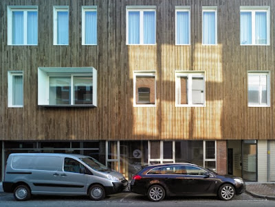
| From outside, calm city street pass this unique apartment design which looks elegantly different from the rest of the multiple story building here. |
The cool
furniture upgrade idea is to make do most of the limited apartment
space for as much furniture as possible, but not in the way of cramming everything
inside without considering the aesthetic and the efficiency of the furniture.
For example, the concept of the kitchen is boxing the furniture so that it
would look much more modular and simple, like putting the fridge inside a
shelf, while having the dishes put on top of it. There is also a hidden
vertical drawer to put all the kitchen maintenance stuff such as towels,
cleaners, and so on.
Combining with the kitchen station is the living room, which consists of
just a single chair and a table, with a huge cupboard behind, reminding us of a
classic family room in a suburban house. This simple yet effective combination
is quite cool and minimalist, although it feels a bit nostalgic.

You probably wonder from the start about the black swirling thing by the
bed. yes, that is actually a stairs going up. The design of this stair is so
efficient and space saving, it is hard to miss for a great addition to your
apartment upgrade. Imagine how cool it is having a two story apartment with
swirling stairs that stands out from the rest of the room. You can always
search for more of this cool furniture upgrade
information on other sites. I
hope this article is useful for you.
 |
| Cute round sofa on the corner accompanied with living green -- they're just too perfect to complete the house interior in extra minimalist style. |
 |
| White and orange house interior disguise the 'less' inside, for example the rough wall surface on the entrance. |
 |
| When the door is closed, the room on the back can fuse smoothly to the rest of the home and seem practical. |
 |
| The ceiling is showing the building structure, which adds more variation to the plain minimalist style of the entire home interior. |
 |
| This small apartment is perfect for people who prefer simplicity and thus need practical and minimalist room layout. |


Post a Comment