Good day, design enthusiast! Today, Interiornity presents you yet another beautiful residence located in the towers of Sundance Square. That's right, this time's inspirational interior design takes our focus into this lovely gentleman abode. Designed by Dorothy Greenlee with countless experiences for the past thirteen years, this residence provides simplicity in style and comfort. The concept of open plan living makes this residence offers various relaxation and precise functions that is seems to fit the life of young gentleman. Have a look and see for yourself.
The simplicity in design clarifies a modern style, promoting clean lines and less fussy environment. This make it suitable for a young and fast paced people. Designed with a small office and meeting area, this condo really has it all when it comes to provide relaxing working space. We also love the pops of orange that gives the living room a refreshing vibe.
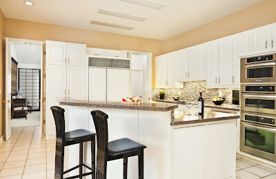
The kitchen in this condo features a wood cabinetry with a granite finish on the counter top. Simple, elegant, yet still modern. This kitchen is open to the rest of the entire area, makes it accessible easily. The transitional appearance make it less empowering in the entire living room.

This small office is relaxing and free from clutter. Simplicity in design is featured here, as well as beauty as provided with the beautiful view outside. Focus on the plan as well as to work is very important to working businessman, therefore the color black is a great idea when designing a home office. Bringing gentleman style, the sophisticated in black also represents a determined self to finish a task quickly with best performance.
Apparently not focused only for a gentleman or businessman. This condo has three bedrooms and two baths, which is quite reasonable for a small family to have. An extra space is also available besides than the main room. That is, the less strict and home office-like spaces. This kitchen, for example, brings compact appliances and storage in another level. Beside than the sophisticated black stools, the rest of the kitchen is furnished in white. Granite counter top ties them all together. |
| Exclusive black and white rectangle tiles ties up the white and creamy wall painting for this classy kitchen design. |
If you want to have an addition of working space in your home, you can always look for inspiration in our other posts. Some are made elegantly as an addition of a bedroom, some are fused into the living room corner, and some are even occupying only small space that is previously not used. These home office designs are ranging in flexibility and level of functions. We hope you can find your dream home office. Nonetheless, you can always look for inspirations from our daily, Interiornity's featured interior design.


