Are you planning to build a craft store, but looking for some design
insight that will be unique and stands on top of the others? Well, that is a
tall order. But nobody says that it is impossible. A craft store design needs to be in par with what is sold inside. If
you are selling used items like in a thrift shop, you probably won't need to do
much about the store. But if you are displaying rare and antique collections
that is probably way more expensive than an average person's yearly salary,
you'll need something else.
Here is a craft store design idea
that might be useful for your reference. Dubbed the birdhouse, this building is
nowhere near an actual 'birdhouse' but still is extraordinary in terms of
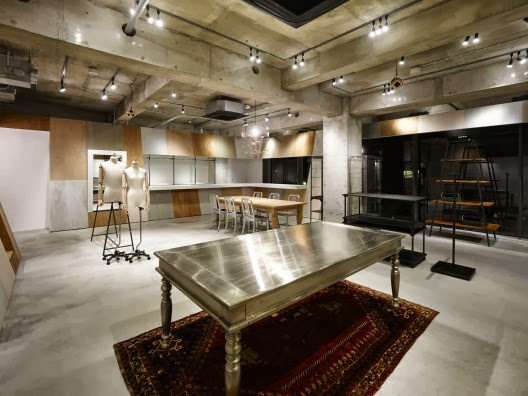
design and value. The one and only architect who built this, Takato Tamagami, design the entire place to make it almost look like a factory,
combined with eclectic furniture and pedestals to display the items. The
ceiling even look as if we're in some kind of basement, yet there are hints of
classy features such as rugs, luxurious tables and so on. It is as if the place
is an art installment.


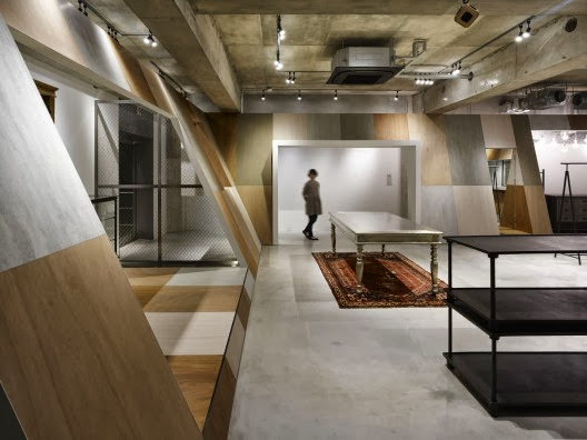
But its apparently not everything, at least not yet. The most prominent
design displayed here is the slanted walls that divide some of the spaces into
several sections, where one spot is much more open and free to roam, and the
other is confined, closed space, perfect for resting. It is probably a very
brilliant idea for a store to have one. A spot to show the items, and another
perfect spot to take a break. While a craft store rarely gets popular
for an average person, but for those with certain interests might find this
design pleasing.

In summary, having a place such as this one to display your rare items will
be quite nice and worth every penny. I really recommend looking at this
particular craft store design more thoroughly and make your own to be better.


